Design tips, Publishing

It is a truth universally acknowledged that a self-published book is difficult to get into a bookstore

I love making children’s books. It is something I wanted to do since I was very little, and through a good mix of luck, determination, stubbornness and maybe even some talent too, I can say with confidence, that this is my job.

You name it, I have worked on it. From picture books and novelty books, to magazines and annuals, fact books and activity books, e-books and lots and lots of primary school learning content! Mostly these are books that I create for other authors and publishers, but I also have a head bubbling with ideas for books that I intend to write, design and illustrate myself.

One of the big discussions that often comes up for me at networking and mastermind groups, is, why don’t you just self-publish? I have done this successfully (incidentally you can find my first picture book, Reynard the Fox here). Or, do I go down the traditional route of hopefully finding a publisher to get on board.

Self-publishing is definitely a more dependable option. Once the decision to publish has been made, it is simply down to me to make that happen. I could publish a book next week if I wanted to. However. I have decided against this, for several reasons:

Fresh eyes, Many hands, Light work
I want the fresh eyes of editors and publishers to give me their opinions and feedback. I want to take in their comments and resend the book in its updated and improved form. I want designers and art-directors to look and tell me if the colours are working ok, and whether the point-size of the font is too big or too bold. And then I want to rejig those things and send it again, feeling confident that it is revised and perfected a little more. I also want the marketing team of the publishing house to guide me with how best to advertise and sell my book.

Production Quality vs. Mass availability
One of the reasons I decided not to publish Reynard the Fox with any print-on-demand services, such as Blurb or Amazon’s KDP, is because the quality of the printed books is not good enough for me. I don’t feel that their stock options print books that can sit on a shelf next to traditionally printed books. Their quality can work for a novel I think, but for a children’s picture book, which is meant to be read, and re-read many, many, many times over, needs to be something stronger. And the paper needs to be able to show the colour of the artwork at its vivid best.
I must say here that I did achieve excellent production quality with Reynard, as I did much research and chose UK book printers, Biddles. I couldn’t have been more pleased, and I am so proud that my book looks and feels as lovely as any traditionally published title.
The downside of this though, is that my book is not widely available. I have to rely on traffic to my site here, and doing an awful lot of promotion, which I don’t spend enough time on, therefore my sales figures are not what they could be if my book was more readily available through Amazon for example.

Bookstores don’t often like self-published books
This is the big one. Any author who has self-published will know how tricky it can be to get a physical bookstore to stock your title. Unfortunately as self-published books are an unregulated entity, anything and everything can be turned into a book. This means that books worthy of the Booker prize may be self-published, but also books that are of much lesser quality.
And as a self-published title may also lack the production quality of its traditionally published counterpart, most bookstores simply won’t consider your self-published work.
Again, I must say here, that because I was so determined for my book to be ‘the real deal’, my local bookstore has taken copies of Reynard. For me, this was an incredible achievement. And one of my proudest moments as a creator of children’s books, to see my title sitting proudly alongside some incredible names in children’s publishing.
But one can easily understand why this is not the norm though. Physical shops have to work hard to keep their place on the high street, and stocking titles that are lacking in content or production quality would not be a sound business move.

I feel that I must now explain the purpose of this blog post a little. I have nothing against self-publishing at all. It is a method that works – especially as a way of getting an author’s work into the public domain. Many authors now begin by self-publishing, and then secure book deals later on. And for me, self-publishing was a great option for Reynard the Fox. I knew from previous feedback that it was never going to be suitable for the mass market, but there was still a market for it. So a traditional publisher would be unlikely to go for it.

What I will offer up is this: When you are self-publishing, work with as many publishing professionals as you can. Get editors to sub-edit and proof-read. Get designers to storyboard your artwork and style the covers. Commission illustrators to bring your text to life. And above all, listen to their suggestions. All the publishing professionals that I know, love their craft. Our collective goal is to make every book that we work on, the best book it can be. So work with us. Yes, that means we cost money, but know that we are experienced and are here to help.

For me, my next career goal is to find a traditional publisher. This is something that I want very much, for the reasons stated above, but also it is my dream.

For you, if you are an author and looking at your self-publishing options, do get in touch. My specialism is children’s publishing, and I can assist you personally there. But I also know talented people who work on grown-up stuff too. We can help you create a book that will be worth its place on your favourite bookstore’s cool book shelf.

Design tips

The Brief: a de-brief!

Its taken little while to write this latest post. I have been working very hard on some design deadlines – having probably taken on one too many overlapping projects. And  after Harriet’s stomach virus from three weeks ago, she then came out in a horrendous cold, which then developed into tonsillitis. Then after a week of penicillin she was raring to go, and now has Hand, Foot and Mouth (it sounds Victorian, and is a bit like chickenpox). Needless to say, our house is full-on at the moment!

Indeed, what should have been Noel’s birthday tea a couple of weeks ago, turned into a not-very-hungry supper for himself and Sidney, whilst Harriet and I spent the evening on the children’s ward of our nearest hospital for her to be checked out. Not very cool. But all is now well, thankfully, apart from the Hand, Foot and Mouth (Insert swearword).

My top tips to writing a successful art brief

So in the non-existent down-time I have had recently, I’ve been mulling over what design tips to offer up, and I reckon that coaching you on best practices for briefing your designers and illustrators could be great ways to:

  1. Improve the quality of your finished product
  2. Potentially speed up your approval process
  3. It might even save you money too!

Whether you are commissioning artwork for a book, a logo, a business card or branding for your mobile diner – getting your initial briefing right is first and foremost going to get you a good working relationship with your designer or illustrator. And if you get your design team on board, you stand a much higher chance of your artwork coming in on schedule and to budget. So here are my top tips to writing a successful art brief:

Choosing your person
Hopefully you have chosen your illustrator or designer based on something in their portfolio that you like and would like to assimilate yourself. But instead maybe they have been recommended, or they are someone that you know and they have volunteered their services. Whichever way, a good place to start is by looking at their portfolio and picking some examples of their work that you like. You can also show them examples of other work that you like. Styles of drawing, particular colours used, fonts that you are drawn to. This is a great way to show your designer what you are thinking of. Pinterest is a really handy way to show designers your ideas. Its visual and can provide a great way of creating a fantastic mood-board, which can itself become a pretty solid version of a brief.

Schedule
This is a key feature of your initial discussions. Most good designers and illustrators will be busy and in demand, so it can be a little unrealistic to assume that they can jump onto your project straight away. Depending on the scale of what you are asking, you may need to wait a month before they can even get started. You might have an idea of how long something will take, but your designer will be able to give you a realistic response of their availability. In my experience, not rushing things through is always a better approach to getting the results you want.
Outline the timeline that you have, but be prepared to adapt.

Budget
Like with planning your schedule, the budget is something that needs to be established early on. Different designers and artists will have different approaches as to how they charge for their work. Some charge by the hour, some charge by the project.
I tend to charge by project, and break it down for my clients into sections, such as Cover and page count. I have a set fee for cover design, and then charge per page for the interior. My page interior fees are calculated by the level of detail and work involved per page. Within my fees I also include three rounds of amends, and any/all final file production.
When you are commissioning, don’t be afraid of what your budget is. If your designer or illustrator is happy to work for you and you have agreed your fee, then you are good to go!

Outline
Ok. The fun bit – the stuff you need designing or illustrating! If you are commissioning a number of artworks, or a full book, it can be helpful to open your briefing with an outline of the content. You should include the target audience, page sizes, the format the content will be in. You can draw attention to key ideas and themes – anything that the designer needs to watch out for throughout. You might also introduce them to characters here, and explain their importance in the work.
Outlining your brief is also a good way for you to be able to explain what your project is in a concise way – it might even help you iron out any sticking points you are grappling with – as you find a way to summarise your work.

Detail
Now’s the time to get to the nitty-gritty! Your designer or illustrator should now have a solid understanding of the sort of work you are asking them to do. So you can now give them the details you require.
Some authors and editors give little art direction, and some give lots. Your designer should be used to working to both styles. If you are happy to give your designer or illustrator a free-reign, that can work really well. I would suggest you ask them to supply you with a few pages or artworks to check you are happy with the direction they are going.
Alternatively, lots of direction can potentially mean a slightly quicker turnaround, as it means slightly less thinking time required on the designer’s part.
Neither method is right or wrong – as you get your project underway – you will find your own level of involvement. My best suggestion is to encourage your artist or designer to ask lots of questions and that way, any issues can be worked out early on.

However you choose to put your art-brief together, I hope you find these suggestions useful. It really is worth putting the time into writing your brief – life will run much smoother for you if you do! (Smoother life = happy life = #lifegoals)

Best of luck in your projects – and I shall try not to leave it so long next time!

Sarah xx

Design tips

Colour me Autumn

The days are starting to shorten, and the evenings are getting chillier. Things are definitely Autumning up around here, and as the colours and the light are changing too, I felt this Autumnal theme could make for a good post about colour.

I genuinely fell in love with colour, and the incredible power that it can have

Colour is something that is very important to me. During my first year at Camberwell studying Illustration, I spent an entire term learning about colour – how it works, how it can be manipulated, and generally loads of great things about it. It was during this elective that I began developing my monoprinting technique, which ultimately led me to create Reynard the Fox in the way that I did. I genuinely fell in love with colour, and the incredible power that it can have, so I am going to share some of that love with you – and perhaps it will help you to make choices in your own books and business branding, maybe even your home interiors too!

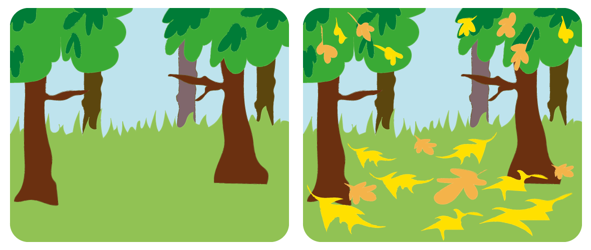
One of the loveliest ways that we can see the light around us changing at this time of year, is the way in which leaves on the ground reflect much more light than dark grass and grey pavements or roads. Yellow leaves especially can seem to light the world from the ground up. The atmosphere is given a warm, often matte and a smoky sort of look. Look at these two images:

08_colour-me-autumn-graphics1_v3

Next time you are walking along a tree-lined street, or park full of trees, really try to notice the light around you. Look and see where the light is coming from.

Thinking about Autumn’s wonderful colour palette is a happy, indulgent place for me

As a parent to young children, the part of me that used to love the onset of Autumn, and the re-introduction of my scarf cupboard, now instead sighs at the onset of the snot season and the amount of tissues that I will find in my pockets at the end of every day until March. (Does really big sigh). So thinking about Autumn’s wonderful colour palette is a happy, indulgent place for me.

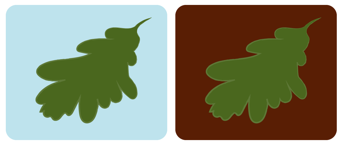
Whenever I am designing anything, thinking about the colours I use is a crucial stage. Something that is slightly too yellow, or a purple that is too heavy can really affect the success of a page. But it is not the heavy purple that is doing the damage. Or the yellow that is too yellow. Instead, it is how that purple or yellow is acting next to the colours that sit alongside it. A colour can totally change its appearance based on where and how it is placed. Take a look at these oak leaf graphics:

08_colour-me-autumn-graphics2-v2

Both of these leaves are the exact same tones and shade, but they appear completely different depending on what colour they are placed with. When placed on the deep burgundy, the oak leaf appears to be much brighter than when placed on the pale blue. When you are choosing colours for your brand, or even your bedroom wall, it is not always about choosing ‘the exact colour’. It is about choosing a colour that looks the way you want it to, when it is placed in context alongside something else. Here is another example:

08_colour-me-autumn-graphics3

Again, its tricky to see that both words are the exact same tone of yellow. The top one, sitting on the cool shade of green looks like a colder image, and the yellow itself looks a more ‘muddy’ yellow. The lower graphic generally feels warmer, with the heat of the burnt orange. Yet the yellow text actually looks ‘cooler’.

one colour used on two different backgrounds, could have a very different meaning

If you are clever about your colour choices, and you choose three colours to be the core colours for your business, those three colours could actually become many more than three, when used alongside each other. And therefore, one colour used on two different backgrounds, could have a very different meaning.

Autumn is a special time of year, even though it brings with it the onset of Winter, and also SAD (Seasonal Affective Disorder), something I can definitely relate to in the slog that is January and February. In order to help combat this, let us think about the joy of colour, and how this time of year can actually bring a warmth of yellow, orange and deep burgundy that is a true feast for the eyes. I am going to try and spend a few moments of every day observing the light and colours outside … And maybe I’ll pull out a good scarf or two – just for a treat!

Design tips

Designing everyday tasks …

… Otherwise entitled, “How to fill a blank page”

I think about how things look all the time. We are very slowly renovating (sounds way more glamorous than it is) our Victorian house, and because I work from home, am home with the children a lot, and rate myself quite highly on the introvert scale … I spend a lot of time in our house. So I spend many hours imagining how our house should look: what shape the furniture needs to be, what colours will lighten everything up, and how can we make modest rooms feel big. This is something I genuinely love to do – daydreaming how I’m going to turn a fairly ordinary woodchip-covered cottage-house, into a smart, minimal, dreamy, LivingEtc-worthy super-cool period house. (This will become my life’s work, I suspect …)

The way I approach my design work is the same. What is the text going to tell people? How am I going to make this copy turn into the most beautiful, cool and engaging book that I can? Do I need other people to help me, or can I do this all myself?

These questions can be related to anything, when designing or creating a document is involved – be it a marketing poster, a website, an invitation, a book, a business card, even a set of instructions. So below I have listed a few key things to think about the next time you have a document to design:

Who is this piece for?

Who is my end-user? Is it a customer or client? Is it a child or a parent? The answer to this question should determine how you choose a suitable font. It should also help you decide what images are appropriate, and the format of the content you are creating. It may influence what colours you use – do you want to attract men or women, or both?


Logos or branding

If your document is a piece of marketing, you will want to show your brand logo or name – this helps to build your brand story. It also helps people engage with you and your brand, and will help them understand who is behind the content. The more they can see your branding, the more they will remember you.


Fonts

Fonts indicate a lot without many of us even noticing. They are a bit like clever cats, having the ability to make us see and do things we didn’t even realise! A well-chosen font will mean the difference between people reading your content, and giving up after the second line. If the font is for full paragraphs of text, you probably shouldn’t choose something too decorative and twiddly. If it’s a font for a picture book, have a look at the illustrations, and try to find a font that reflects the shape of the drawings – if the characters have very round faces, a font with very rounded letters will match really well.


Images

When I am organising any poster or page in a book, it is always a good idea to see what images you have that you can use. Get them on the page and see how big they can potentially go – this can help you build a shape to your layout. It can also be a good way of shaping the direction of your text.
Likewise, images can be used as graphic holding devices for your text. If you don’t have any photos or illustrations to use, creating graphic holding devices (eg. a cloud shape with your text inside) can be a great way to create a shape and narrative to your page.


Hierarchy of information

This is a big one for marketing content. Understanding what information is most important will guide the font weights and sizes you use. Titles and sub-headers or introductions should be clear and pull the reader/customer in. Underneath that, your main copy, or body copy should be clear but can be smaller as there will be more of it. The hierarchy of information will tell your customer the key information they need to know – make sure key facts are clear, maybe bulleted and not hidden.


Colour

This subject seems a little extravagant after all the other headings. I love to use colour, but often work in black and white, with maybe one colour – when I am first building my layouts. This helps me to get the order of content and the shapes on the page correct. Once I am happy with a layout, and the text is reading well, then I start to introduce colour.

I hope you find these suggestions useful. Over time I will expand on all of these. Taking the time to implement these ideas will really lift the way your content is presented, and therefore enhance your brand, book or business. … As well as making you look like a cool hipster-design dude … Win-win I reckon! x