
The days are starting to shorten, and the evenings are getting chillier. Things are definitely Autumning up around here, and as the colours and the light are changing too, I felt this Autumnal theme could make for a good post about colour.
I genuinely fell in love with colour, and the incredible power that it can have
Colour is something that is very important to me. During my first year at Camberwell studying Illustration, I spent an entire term learning about colour – how it works, how it can be manipulated, and generally loads of great things about it. It was during this elective that I began developing my monoprinting technique, which ultimately led me to create Reynard the Fox in the way that I did. I genuinely fell in love with colour, and the incredible power that it can have, so I am going to share some of that love with you – and perhaps it will help you to make choices in your own books and business branding, maybe even your home interiors too!
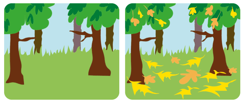
One of the loveliest ways that we can see the light around us changing at this time of year, is the way in which leaves on the ground reflect much more light than dark grass and grey pavements or roads. Yellow leaves especially can seem to light the world from the ground up. The atmosphere is given a warm, often matte and a smoky sort of look. Look at these two images:
Next time you are walking along a tree-lined street, or park full of trees, really try to notice the light around you. Look and see where the light is coming from.
Thinking about Autumn’s wonderful colour palette is a happy, indulgent place for me
As a parent to young children, the part of me that used to love the onset of Autumn, and the re-introduction of my scarf cupboard, now instead sighs at the onset of the snot season and the amount of tissues that I will find in my pockets at the end of every day until March. (Does really big sigh). So thinking about Autumn’s wonderful colour palette is a happy, indulgent place for me.
Whenever I am designing anything, thinking about the colours I use is a crucial stage. Something that is slightly too yellow, or a purple that is too heavy can really affect the success of a page. But it is not the heavy purple that is doing the damage. Or the yellow that is too yellow. Instead, it is how that purple or yellow is acting next to the colours that sit alongside it. A colour can totally change its appearance based on where and how it is placed. Take a look at these oak leaf graphics:

Both of these leaves are the exact same tones and shade, but they appear completely different depending on what colour they are placed with. When placed on the deep burgundy, the oak leaf appears to be much brighter than when placed on the pale blue. When you are choosing colours for your brand, or even your bedroom wall, it is not always about choosing ‘the exact colour’. It is about choosing a colour that looks the way you want it to, when it is placed in context alongside something else. Here is another example:

Again, its tricky to see that both words are the exact same tone of yellow. The top one, sitting on the cool shade of green looks like a colder image, and the yellow itself looks a more ‘muddy’ yellow. The lower graphic generally feels warmer, with the heat of the burnt orange. Yet the yellow text actually looks ‘cooler’.
one colour used on two different backgrounds, could have a very different meaning
If you are clever about your colour choices, and you choose three colours to be the core colours for your business, those three colours could actually become many more than three, when used alongside each other. And therefore, one colour used on two different backgrounds, could have a very different meaning.
Autumn is a special time of year, even though it brings with it the onset of Winter, and also SAD (Seasonal Affective Disorder), something I can definitely relate to in the slog that is January and February. In order to help combat this, let us think about the joy of colour, and how this time of year can actually bring a warmth of yellow, orange and deep burgundy that is a true feast for the eyes. I am going to try and spend a few moments of every day observing the light and colours outside … And maybe I’ll pull out a good scarf or two – just for a treat!
